5 Things You Should Remember During The Next Design Iteration
Quick guidance for design iteration
Each successful startup gets the point on its development road when it is time for a fresh breath of air. The second redesign of the interface - either a simple website or a complex mobile application - everything needs it. After a proper product launch, good marketing campaigns running, and creation of the network of first trusted users, the company's senior management may decide to take the next serious step of product improvement.
The great advantage of small/medium startups comparing to big stable companies is the ability to conduct such process pretty fast and receive the results immediately. But this redesign process itself may be performed in probably not very «standard» way it usually happens. Likely there are no chances to gather the appropriate focus groups, to prepare numbers of interviews with real users, to have the sessions of users' observations and empathy, to test the redesigned prototypes with potential customers, and make the next rounds of prototyping-testing-prototyping, etc. Big eminent companies can afford all of this and, of course, they shouldn't niggle considering their base of trusted customers. But if your case is a startup development, and most likely, you are the only UX/UI/Web/whatever designer (maybe even the remote one) in the team, then you should remember about following things while doing the next redesign of a product.
1.User Feedback And Analitycs
So what're the main results of your product launch? What users actually think about it? And what are the insights from analytics tools? You get it - gather all possible information that is closely related to real users. Ask the marketing and sales teams for the real users' feedback they can share with you. Usually, such people have a direct connection with customers via online chat on the website, email communications, calls, and even personal meetings. The most valuable feedback you can get through these channels - people like to express the brilliant experience of interaction with the product or to complain about different problems during this. And very often that people even do not imagine they are providing feedback, it should be recognized by the team members, interpreted carefully and conveyed to the designer.
Also, do not forget checking of the analytical tools - analyze all displays of user's interaction with the product and move forward.
2.Little Research For Recent Updates In The Field
Let's check out what experience other users have. That's right, we should do research of competitors in the field.
With a cold reason, admit all the best features and solutions they provide for potential users. Actually, become their user for a while - pick up the goal and find out the flow to it. Observe all pros and cons, take interesting ideas, think about tough, unpleasant points on the road.
There are no doughts you know it is a good practice to observe the market-leading players from time to time, not only during the big redesign process. We all should be up to date about what's going on in the field, and only then we are actually able to make it better for all customers.
3.Problem Fixing Which Meets User Needs
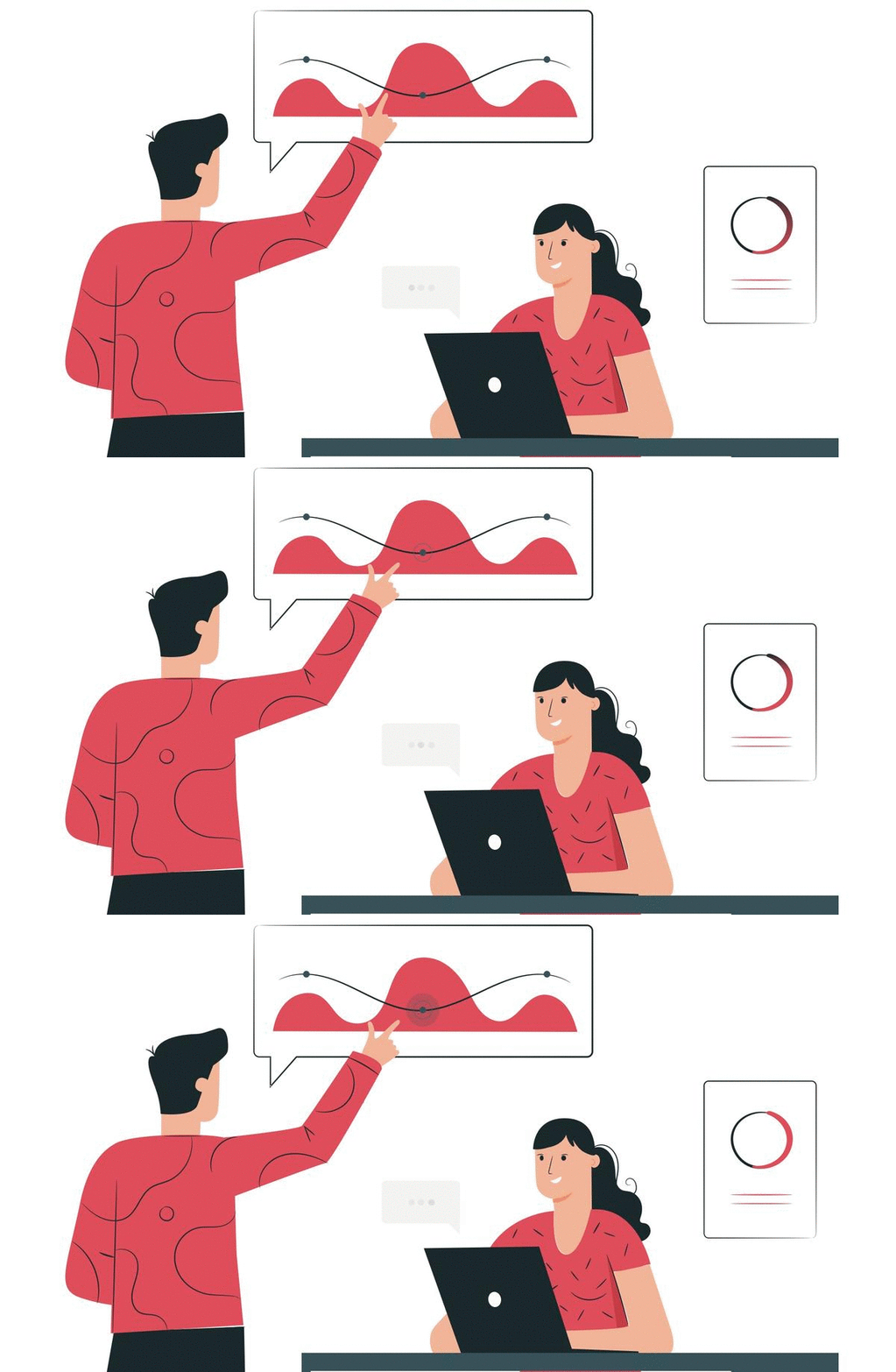
Now layout the general picture of users' problems you've met. We would even recommend creating a list of precise points in your product where the accident took place. Then distinguish the potential reasons for such cases to happen. After, you can create a similar list with the great intuitive moments of your UI - pay attention to what exactly users liked during the interaction with the product, how they explain their experience. Analyzing «successful» UX points of the interface will help you to identify the most successful tools for fixing and enhancement of the sore spots.
And do not forget about the pros from competitors you have found - build an analogy to your case, and you will come up with some suitable solution for sure.
4. Stay Conservative
Remember - you have trusted users of the product already, and you have a list of moments to improve in your UI - so just try to concentrate on this. Do not change everything, and do not design something totally new. In other words, - do not create a problem where it does not exist yet. Users are quite conservative and do not like it when the system they are familiar with (even with all bugs in it) is changing. Try to keep the existing concept of user flows, essential naming, key UI elements, but just make it better.
5.Test It
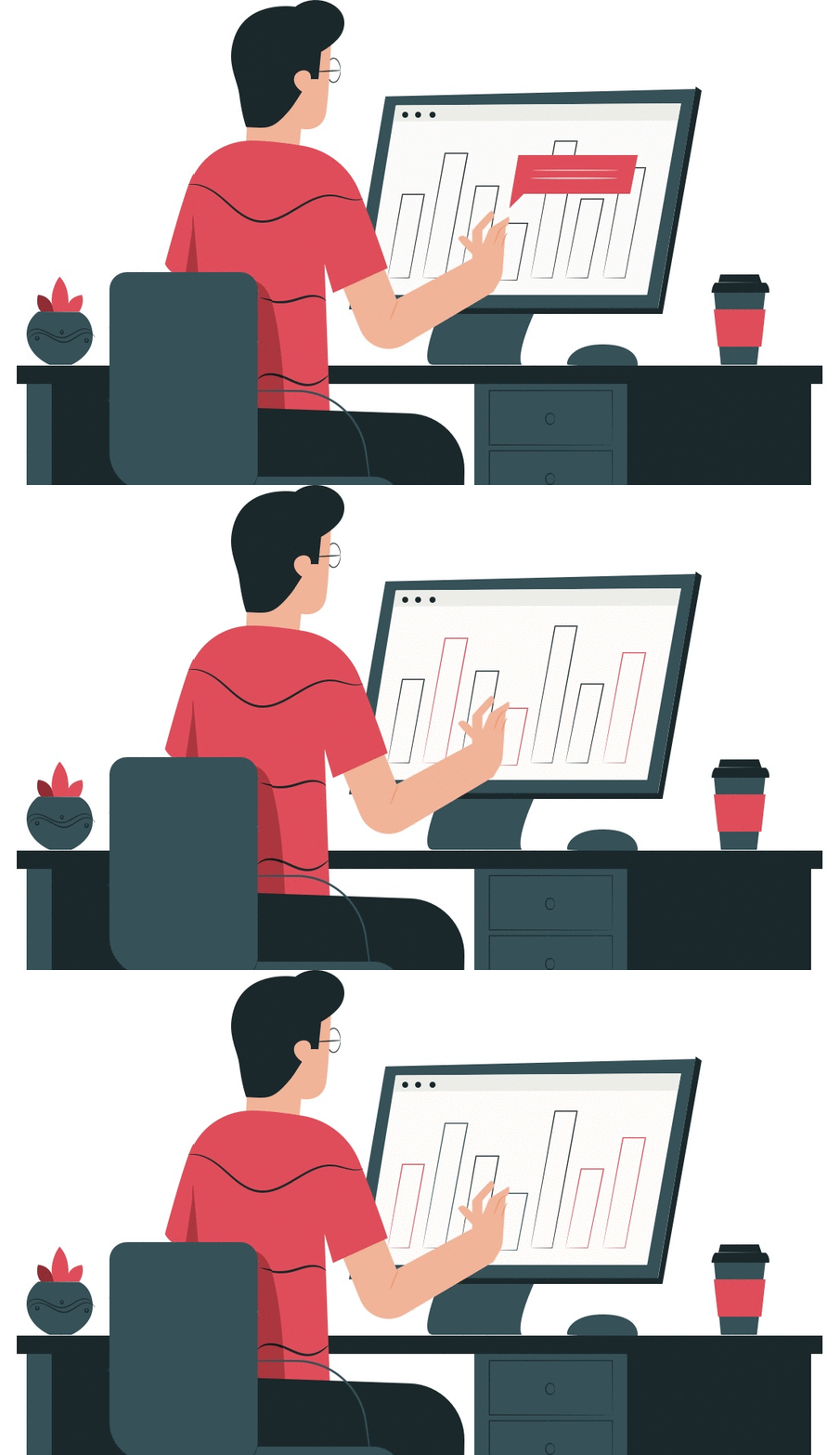
Preparing a couple of variants for the a/b test experiment with different professionals from the team is always a good idea. Usually, colleagues may notice the invisible for the designer issues of the iterated UI. Definitely, they can help to finalize the redesign before a testing campaign, including the most possible comprehensive analysis of the problem. So let's do not forget we're not alone with all of this redesigning stuff.
Camera, motor, action! The observation of the first customers' interaction with the different variants of redesigned UIs means it is time for sweet results - user's feedback. The responsible period of the iteration is waiting, and it may mean the successful finish of the case or the very working process yet.
Good luck with redesigning!
GIFs' source files: freepik.com
Django vs. Aiohttp Performance Test
Today I would like to take a trendy Python framework Django and compare it with a brand new framework aiohttp. I'm a Django fan and believe that Django is a really good framework, and I recommend to use it.
How to encourage your team to participate in meetings
Our expirience with building effective and clear communication.
Work and relax simultaneously. Cyprus for IT-workers
The island in the eastern Mediterranean - Cyprus - is known as a popular outsourcing place for IT-workers from all over the world, and in particular from Europe. What exactly attracts them on this small piece of land among the waters of the Mediterranean

